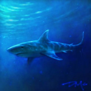
I think I set a new record for the latest entry. But I'm only a couple of months late.
17 hours to process the splash particles (still needs more splash), 2 hours to render.
December 28, 2006
December 20, 2006
December 19, 2006
OOPS!
No one wants a...
December 18, 2006
What Could Have Been . . .
December 15, 2006
"LOST" merchandising campaign that never took off
December 14, 2006
a misfit puppet
December 07, 2006
Kaiser Soze's little brother
December 06, 2006
December 05, 2006
Late Mushroom Entry
New Topic: Island of Misfit Toys
Topic suggestion by Adam Ford. Should be a good one.
Optional design exercise: Line (Again)
Since Kevin was the only one to do a mushroom image, we'll repeat the design exercise. Here's a repeat of what I wrote earlier:
This isn't a call for line drawings necessarily, but rather a push to be conscious of what kinds of lines define the edges and shapes in your image, and how they relate to each other. For anyone who wants more information on line here's some good information from Andrew Loomis on line from Creative Illustration: Section on Line, line and composition, line as attention-getting device, relationship of line to emotion Plus, a couple posts from Mark Kennedy with information on line of action that might be useful. That last one he says is on Rhythm, but it seems to have more to do with line than rhythm (plus, we'll have a rhythm exercise later).
December 01, 2006
November 27, 2006
November 26, 2006
November 22, 2006
November 17, 2006
Mini-challenge topic: MUSHROOMS
This is for those among us timid folk who dare not draw pictures of those who we wish to work with for years to come. This is a pretty broad topic, I guess just because mushrooms and other fungus make for cool visuals no matter what the picture is. Mushroom characters, objects, environments, all fair game.
Optional design exercise: Line
This isn't a call for line drawings necessarily, but rather a push to be conscious of what kinds of lines define the edges and shapes in your image, and how they relate to each other.
For anyone who wants more information on line here's some good information from Andrew Loomis on line from Creative Illustration: Section on Line, line and composition, line as attention-getting device, relationship of line to emotion
Plus, a couple posts from Mark Kennedy with information on line of action that might be useful. That last one he says is on Rhythm, but it seems to have more to do with line than rhythm (plus, we'll have a rhythm exercise later).
New Topic: "Caricatures of Avalanche Employees"
Draw, sketch, paint, or sculpt your favorite co-workers. We don't need to post the names of our subjects with the artwork...that way if they don't think they look like that, they can keep believing it isn't them.
Baron Friedrich Von Ghoulsmire III
Ok, so I know I'm late, but I figure if they can start playing Christmas songs on the radio in September, then I can post a creepy Halloween painting in November. So I'm killing three birds, or rather art challenge topics, with one stone here: The Goulsmire thing is pretty obvious; he's of royal lineage; and he just happens to be the great, great, great grandfather of John Locke, on his mother's side. So there ya go. Oh yeah, he also meets the portrait requirement of the last pre-blog art challenge, so that's FOUR birds. Ha!!!
November 16, 2006
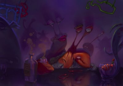
Jacque le Crabe (Jack the Crab)
Jacque is a French actor; well, I should say was a French actor. See, Jacque’s career started splendidly: after just a couple of successful plays in New York, he got a part in a Disney movie, playing some kind of a conductor/babysitter. Later on, he played an obsessive compulsive in a Pixar production. He even performed on Broadway!
Unfortunately for Jacque, parts for French crustacean started to get sporadic. He tried to move on to TV but without success. He just got one part as an extra in the TV show “Lost”. You could see him scurry past Hurley’s feet at one point…
Now Jacque is drinking all alone at the Triton CafƩ ready to be the victim of a deep, very deep depression.
It’s hard to be a French crab sometimes!
I put a step by step and a little video on my blog for those who are interested.
http://letiroirabazar.blogspot.com/
November 15, 2006
Creatures of the deep: Dave goes off the deep end
I have come to realize that in my digital art I have been clinging too religiously to my traditional art painting techniques, and not embracing the possibilities that come from painting in a virtual world. ("You think that's air you're breathing?")
I realize now that just as "there is no spoon", there is no paint, (how's that for deep) and therefore I decided to paint my entry for the Avalanche Art Challenge ENTIRELY WITH THE GLOWBRUSH! That's right, this is 100% glowbrush, nothing else.
November 14, 2006
CREATURES OF THE sanDEEP
Though scientists know little about them, the Chennai Squid (first discovered off the coast of Eastern India in 1947 by a computer programmer/fisherman) is a nocturnal creature that feeds on starfish and sea cucumbers. They are harmless to humans. Though most remain within 100 miles from where they were born, some specimens have been known to migrate half way around the world.
November 13, 2006
Landscape of the Somewhat Deep...
This is one of the first paintings I *completed* since working here at Avalanche. I thought it would be cool if naval travel over land was magically made possible...interesting idea and rudimentary implementation.
Please hack and slash at this one. The only way I can improve is to see what I can do better next time...
November 11, 2006
eel of the deep
November 10, 2006
Unintended consequences
November 09, 2006
November 08, 2006
Contrast shape design
It Came from the Deep
April 24, 18 dickedy-doo,
As we were fishing off the port of New Evanshire. We were met by the most terrible beast. It came from the deep and measured a stack tall and about two rods in each direction. With a head of a toad, the body of a seal, and tentacles, its mouth steeped with teeth, we lost Jebadiah and Abraham to the beast, while the sea took Ezra. Later that night Avis died in my arms from the Bilious Fever. I may never return to the sea again.
November 07, 2006
November 06, 2006
November 03, 2006
November 02, 2006
A tiny bite
October 31, 2006
New Topic: "Creatures of the Deep"
Could be anything from fish to sea monsters. Funny, beautiful, mysterious, terrifying---anything's game.
Optional design exercise: Contrasting Shapes
For those particularly interested in stretching their design muscles, use this topic to test the principle of contrasting shapes. Use a variety of shape types and sizes in your design and try to position them in ways that maximize the appeal of the design. If you want to push yourself, try to go outside of the norm and incorporate shapes you don't usually use.
Mark Kennedy at Disney Feature Animation has a good blog post here about using contrast and variety in shapes. If anyone else has useful links on the subject please post them as well.
Bwahaahaahaaaaaaa...
October 30, 2006
October 29, 2006
October 28, 2006
Jeff Bunker needs an Avatar
Since he is too "busy" to create one for himself, I think that we should help Jeff develop his avatar for posting. We can all submit our designs and then we vote for the winner.
October 27, 2006
October 26, 2006
Critiques
The blog has been so successful that I'm hesitant to suggest a change. I think that the "just for fun" nature of it is important to that success. However, I think there's no reason why we couldn't be helping each other improve while we're at it.
So here's what I propose: If you want help, ask for suggestions when you post your image. If you don't want help, don't ask for suggestions.
People can either leave critiques in your comments or e-mail them to you, according to your request. These critiques could also include posting or e-mailing paintovers, if the person asks for them.
If you're entering an image just for fun and don't want critiques on it, we'll respect that and just give "good job!" comments instead. Once again, I think the fun of the mini-challenge is probably the most important part.
But I'd love to see the art-smarts getting passed around a little more, too.
Any thoughts?
Also, I had the idea that some of the topics could include an optional design exercise like:
Topic: Castle Ghoulsmire.
Optional Exercise: Repetition of shape---try to unify the design by creatively using similar shapes throughout your image
This would be additional criteria for those who are really trying to push themselves to improve, but completely optional for use when drawing for the topic. Does anyone like that idea as well?
October 25, 2006
Ghoulsmire Shy Cousin
Tim is an introverted, unassuming guy. He is the “cartoonist” of the family, always drawing skeletons and spirals. Everybody thinks he’s weird and nobody really believes in his doodlings. However the butler heard yesterday that he was accepted to the California Institute of the Arts. It’s probably not true. This guy is a failure. He’ll never do anything good with his life. Everybody is sure of it!
Ghoulsmire trick or treater
October 24, 2006
So... I'm guessing we changed the topic again.
Sheesh. Alright already.
October 23, 2006
October 20, 2006
Cousins Vlad and Louis
Subscribe to:
Posts (Atom)