 Well the story here is obvious. Scott's monster(even after a whale for breakfast) came and ate this young girls family for lunch. I guess Scott just wasn't worried about consequences when he created his monster.
critiques welcome.
The official, unofficial blog of Avalanche Software employees. Avalanche is a game development studio. We created the Tak and the Power of Juju property for Nickelodeon and we were recently acquired by Disney. We are currently creating new properties and developing games based on Disney Feature Animation films. This blog is a vehicle to help keep us creatively fresh and help us sharpen our skills... but mostly for fun.
10 comments:
He would've eaten her too if she wasn't so skinny.
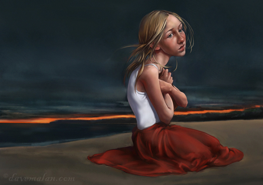
Love: the orange strip of sunset in the background
Not so Love: the far cheak is a little dark
Suggestion: but some subtle orange back lighting on her shirt fromt he sunset.
It's rendered beautifully and very nice emotion. I really like the colors and composition.
There is something a little funky about the lighting that Scott referred to commenting about the back cheek. It is not entirely clear where the light source is coming from. Neck and shirt seem to indicate direction slightly different than face and arms. And light on skirt seems different again.
There is also something slightly wonky with the proportions and anatomy of the lower body. Maybe some indication of calves and feet under the skirt or at least room for them would help.
Having said all of that I wish I could paint half as well. It really is beautiful.
I like it a lot.
Very nice painting. I agree with the comments on the inconsistent lighting, but I don't think that takes away from the piece too much. I do think the gleaming white shirt is a little distracting, but once again not too big a deal. Again, good job.
I nominate next tutorial to be given by dave malan, on portraiture--how to capture the human face...
beautiful work with the face and hair..any tips? any would be helpful... blending colours, etc- thanks, greatly appreciated.
Thanks. Tips? general to specific I suppose with the hair just get tighter and tighter, My hair always has tons of painting over when it doesn't look right. and the final whispy strands aren't put down till the very end. use blocks of color at first, don't try to nail it on the first pass.
same with the face I guess, I have a nice blending brush but I stole it so I can't help too much there.
Oof ... this is really beautiful. I love her expression. I bet what is actually going on in her head is much more interesting than the monster fish story. Excellent work. Breathtaking classical goodness.
I love your work. Great rendering and expession.
Willaston, South Australia,Wednesday, 2nd April 2008 - a little late on the posting sorry but I've only just found the Avalanche blog. (A little late on that one too.)
Great composition, really good colour use- it creates the melancholy atmosphere which infuses the piece.
Three minor crits only, the left hand side of the figure,( body and face) needs just a touch of the orange from the background and I find that the head is a little too big for the body and the neck to which it is attached is a little long.
Having said that, I still like the piece very much.
All strength to your painting arm or PC, (Mac?)) fingers.
Rory Stapleton, (freelance book illustrator.)
Post a Comment