Subscribe to:
Post Comments (Atom)
The official, unofficial blog of Avalanche Software employees. Avalanche is a game development studio. We created the Tak and the Power of Juju property for Nickelodeon and we were recently acquired by Disney. We are currently creating new properties and developing games based on Disney Feature Animation films. This blog is a vehicle to help keep us creatively fresh and help us sharpen our skills... but mostly for fun.
9 comments:
yet another personality rears it's talented head. This ones really nicely done.
I gotta keep ya'll guessing. Maybe I will do installation art next.
Thanks for the comments!
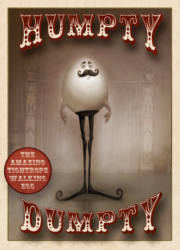
I think that putting a mustache on an egg is pure genius. I love the Coney Island freak sho feel it has too.
I just went to the ringling circus museum in Sarasota Florida - This is perfect for the sideshow poster feel! I love the sepia and the lettering - is that a font?
I really like the eyes on this guy. They really look like they go with that stache and relfect the overall roundness of the egg shape too. I also think that his little arms won't help him much when it comes to balancing his top heavy self. He's a gonner for sure.
The top of his pants look like a suction cup, but how else could he keep them up?
Awesome. I think you did a pretty good job with the shape distrubution also. The only thing that could be improved in my mind is that some of the shape weights in his face feel similar to the shape of his hands/arms. It makes his design feel a little uniform in spite of the crazy proportions you gave him. I think thinning out the hands/arms a little or making his moustache bigger (I think that's the one that feels the same) would solve the problem.
His face is just classic & I love the ol'-timey feel.
wow fantastic blog! There's so much amazing work here. I'll definitely have to come back for more! :D very inspiring...
Post a Comment